Vela is a personalized universal tracker app that takes its name from the portmanteau of "wellness" and "vitality." It allows you to track everything related to your health, set goals for self-improvement, and is supported by an AI assistant. By managing your mindfulness, exercise, nutrition, and sleep data in one place, it helps you enhance your quality of life.
Color Palette and Design Language
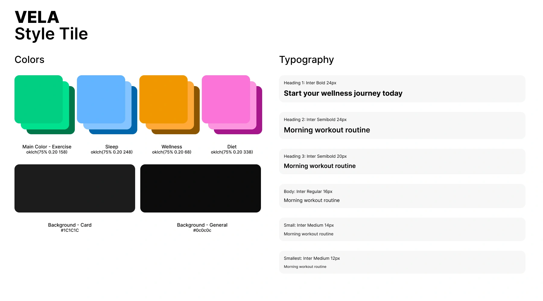
I selected the main colors using the OKLCH color space with equal hue intervals. OKLCH is a human-centered color space that doesn't experience hue shift, so the brightness of the four chosen main colors is perceived equally by the human eye (the screen and browser you're viewing this site on may affect this). I assigned the selected colors to the app's four main categories, so users can distinguish functions even without reading the text. Secondary and tertiary tones were obtained by modifying brightness values equally.
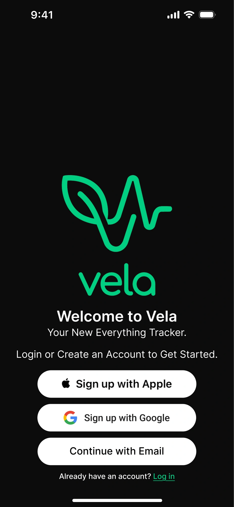
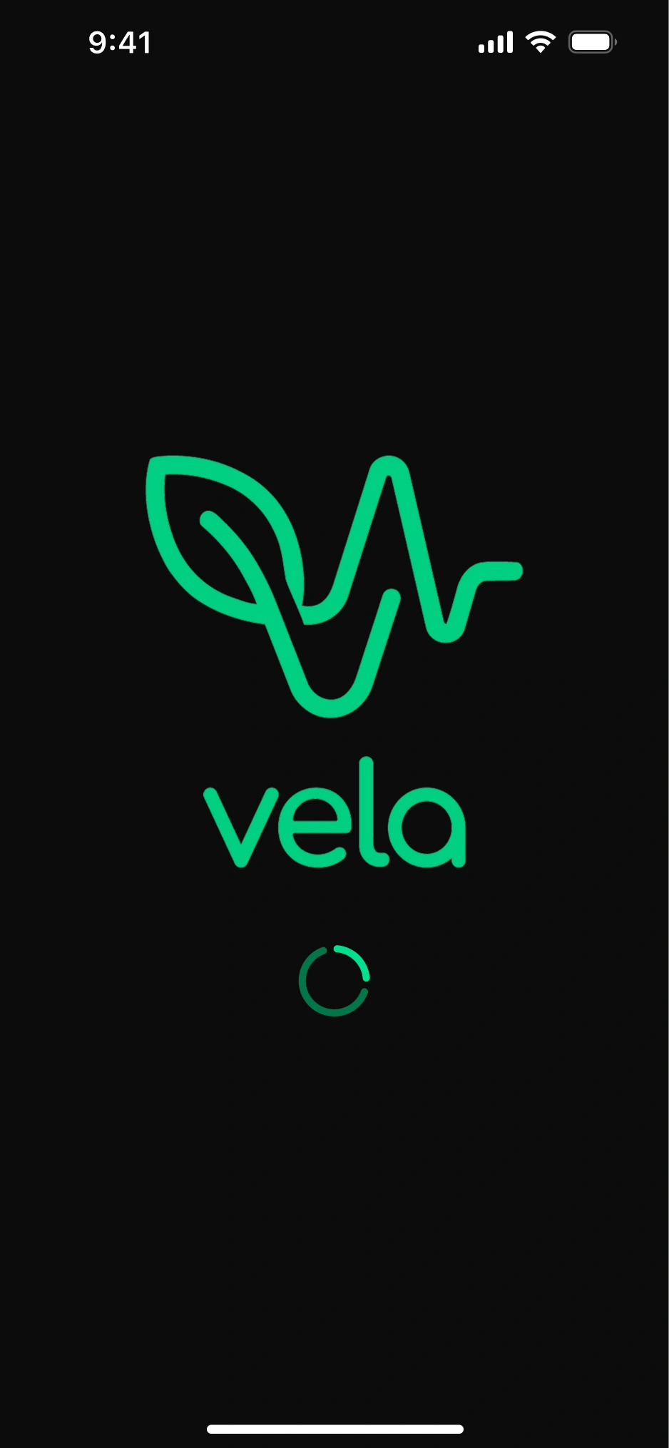
Splash Screen
To unify physical and mental health, I designed a lineart logo blending EKG pulse lines, a leaf, and heart shapes. I created the logotype with custom geometric letters rather than using a ready-made font. I chose emerald green, highlighting the exercise theme, as the app's primary color.
Since the app addresses four topics (exercise, diet, mindfulness, sleep) simultaneously, I coined the slogan "everything tracker". Because the app can't function without basic user information like height and weight, I placed direct sign-up buttons instead of "continue with xyz." Button sizes were determined according to Google and Apple design guidelines.
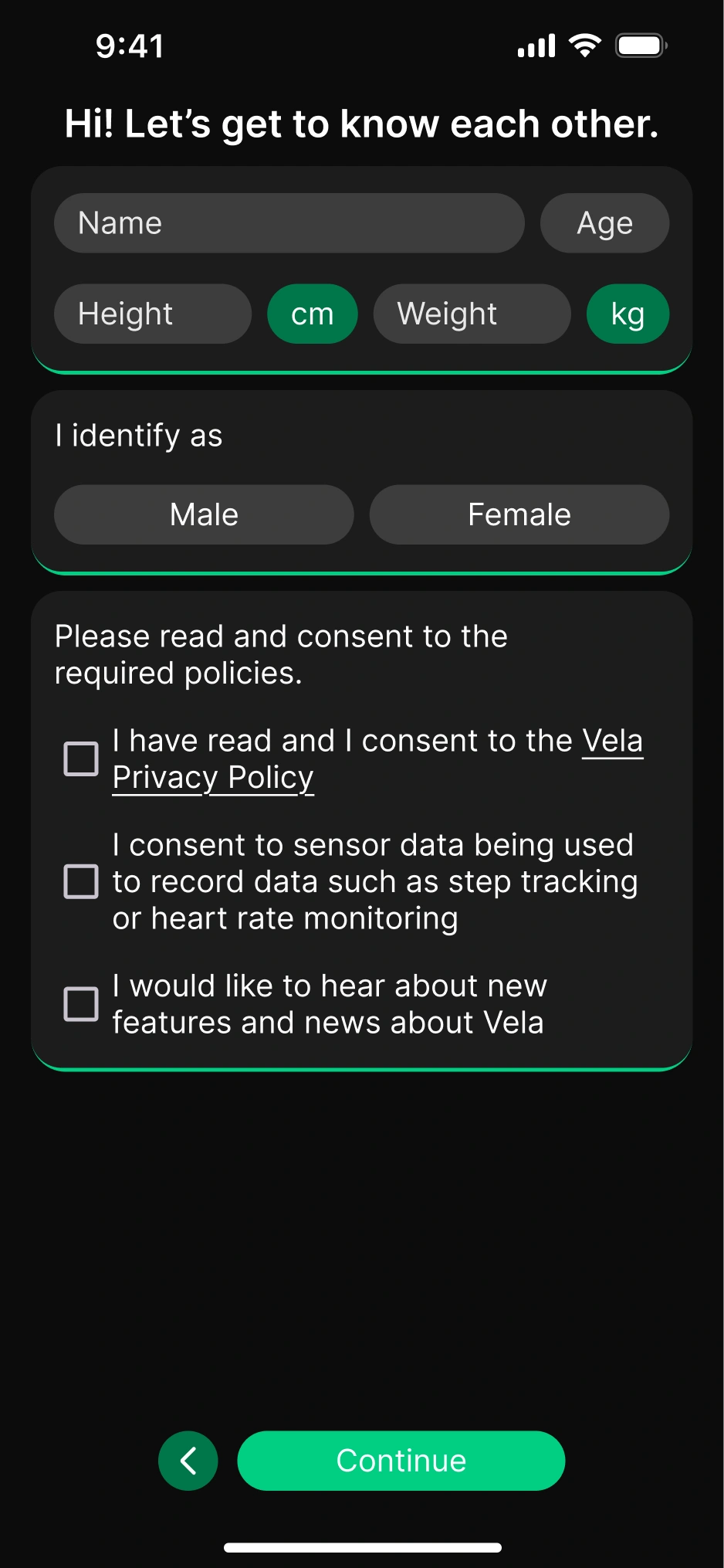
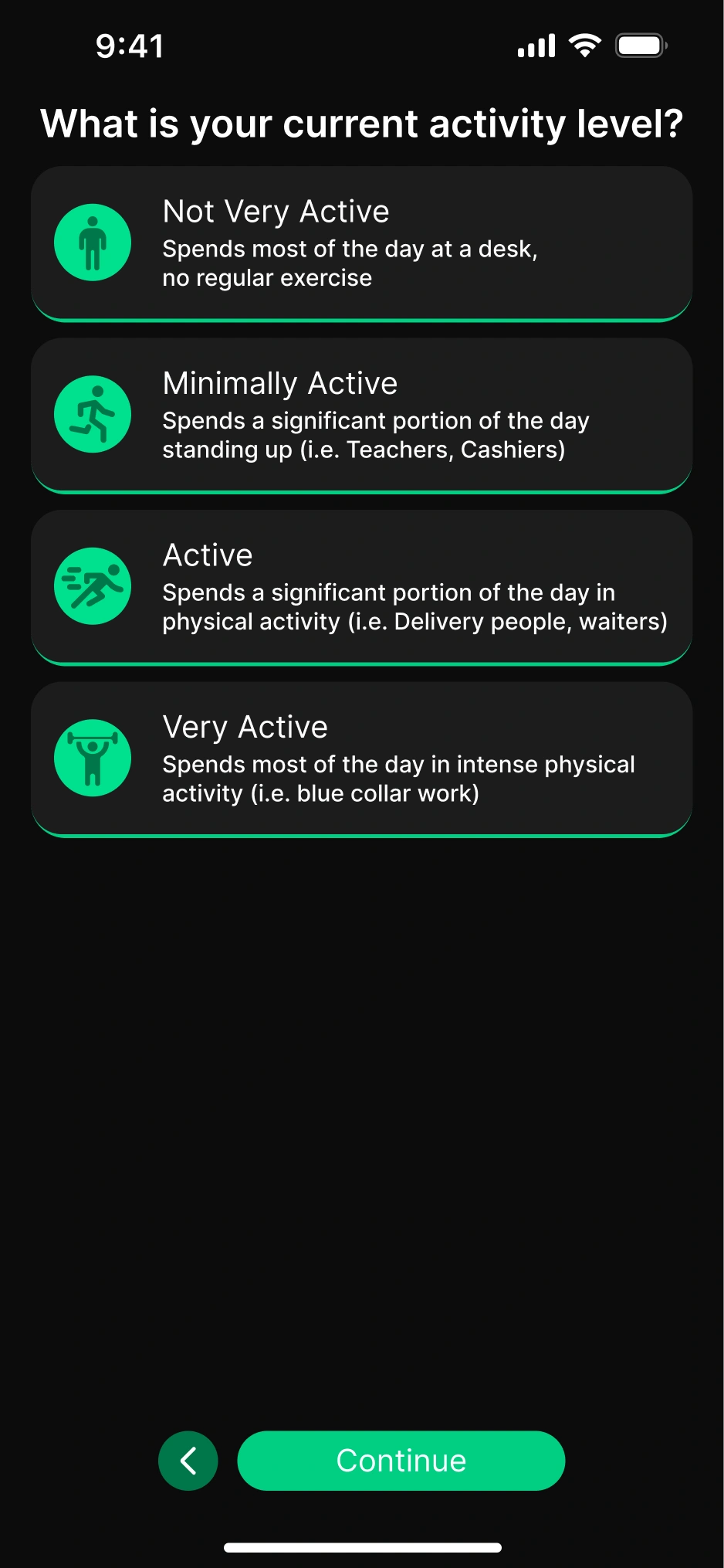
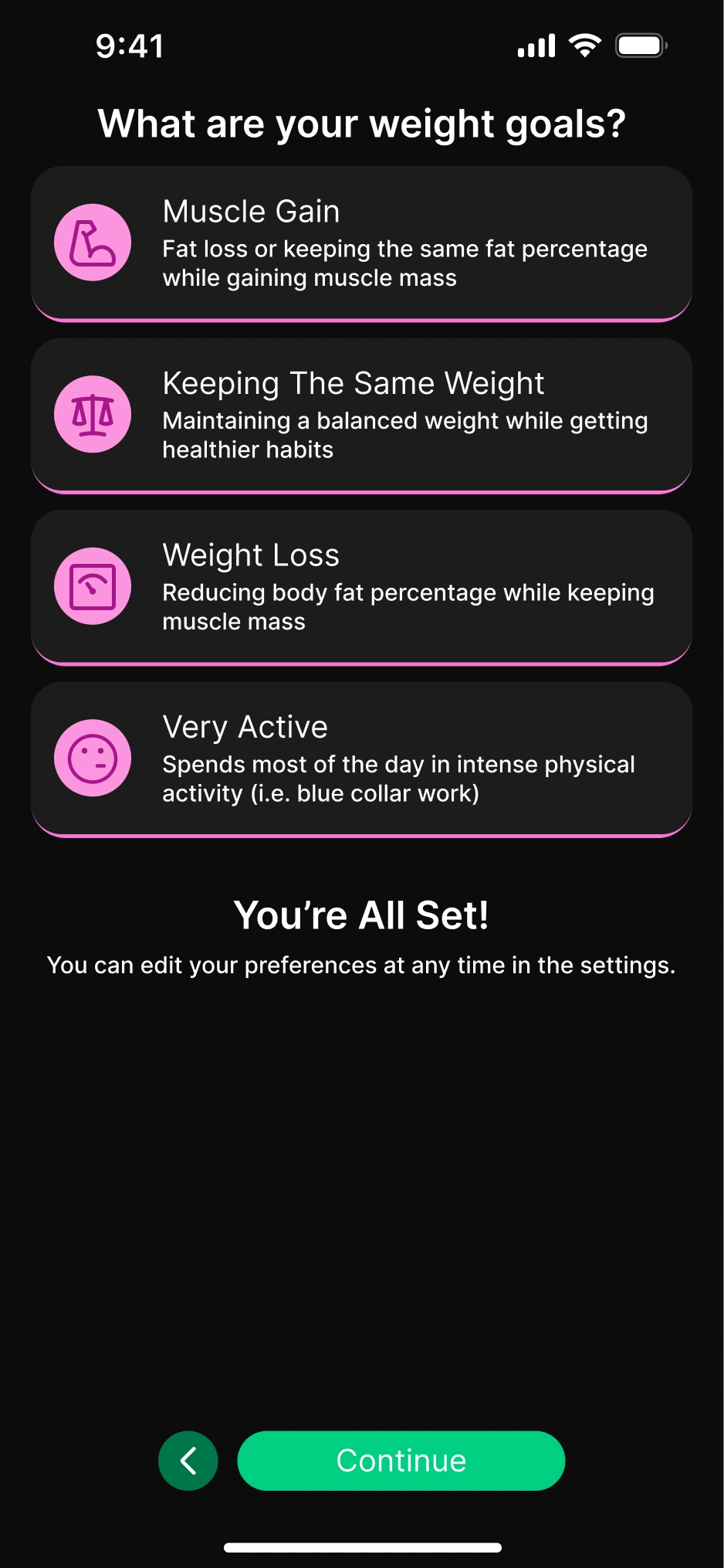
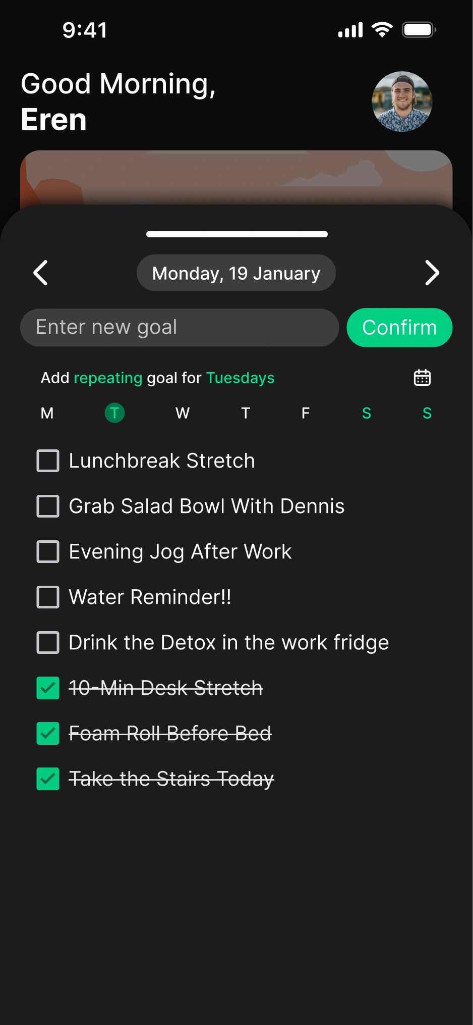
Onboarding
To prevent user drop-off, I kept the onboarding process minimal. The entered information is sufficient for the app to function by collecting sensor data; additional details can be filled in by the user from the profile page. I presented data entry using the standard card and button system used throughout the app; I colored the cards and icons according to their categories.
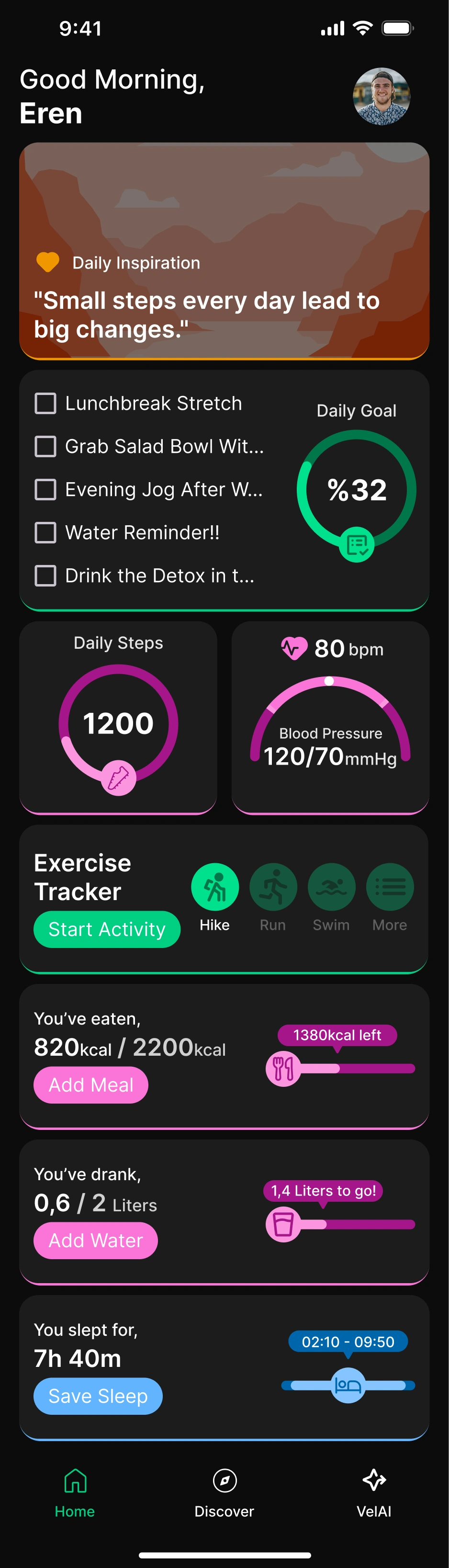
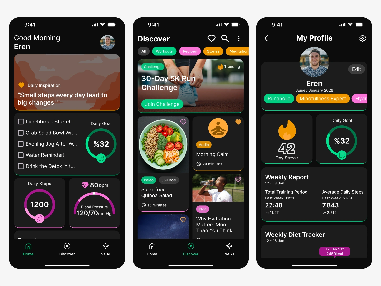
Home Screen
On the interface designed with a dark theme, I emphasized the "elevated" appearance of cards with colored strokes at the bottom. This detail added a subtle 3D depth to the interface. When creating the screen layout, I based it on finger reach ergonomics and priority ordering. I placed the daily motivation quote in the hardest-to-reach top area, while positioning cards requiring actual interaction in more accessible regions. The layout hierarchy is as follows:
- Top section: Daily/periodic motivation quote.
- Most-needed when the app first opens: Daily list, step, and heart data.
- Frequently used cards during the day: Second screen area reachable with a single swipe.
- Bottom section: Sleep card, needed only once per day.
Home Screen – Bottom Drawer
To reduce visual complexity and improve user experience, I placed detailed information for category cards in "bottom drawer" structures that open when cards are tapped, rather than on the main screen. This provides a more compact interface while only increasing menu depth by one click, focusing on speed. The elevated status of the drawer structures was supported with an upward drop shadow.
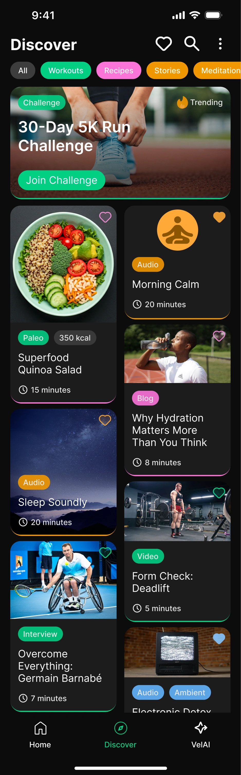
Discover Page
The discover page features a header structure containing favorites, name-based search, and detailed filtering options. I used a tag system showing frequently used items for quick filtering. In the cards section, daily, weekly, or monthly competitions are dynamically displayed based on the user's in-app activity weight. Page content is presented in a masonry layout with infinite scroll. Users can quickly get visual information through card colors and tags, then tap on content they're interested in to see full-screen details. Social features and product/ad placements can be positioned on this page.
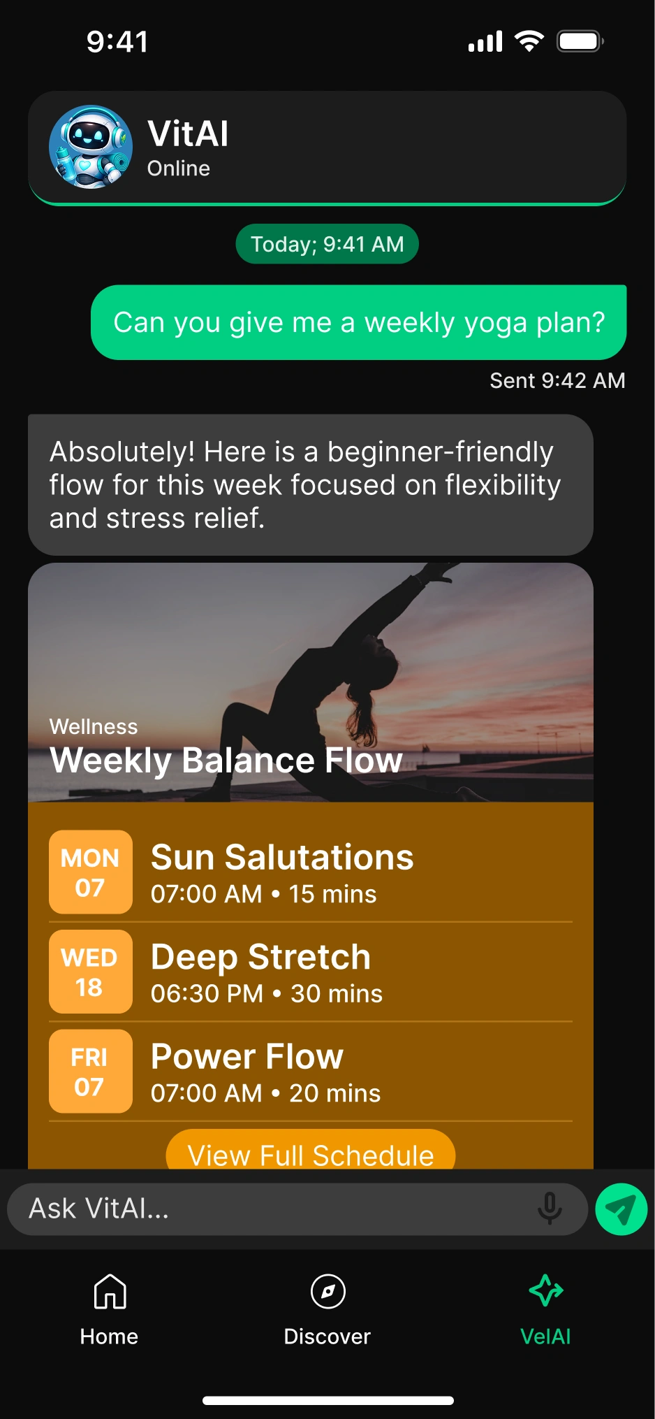
VelAI – AI Assistant
To encourage users to engage with AI, VelAI offers sample questions in different categories. Questions change randomly each time the app opens, which can encourage hesitant users to try the AI. AI messages are delivered not in plain text format, but using "tool calling" or "structured JSON output" features in a format suitable for the app. This allows formatted data to be directly transferred to daily goals, significantly increasing functionality for the user.
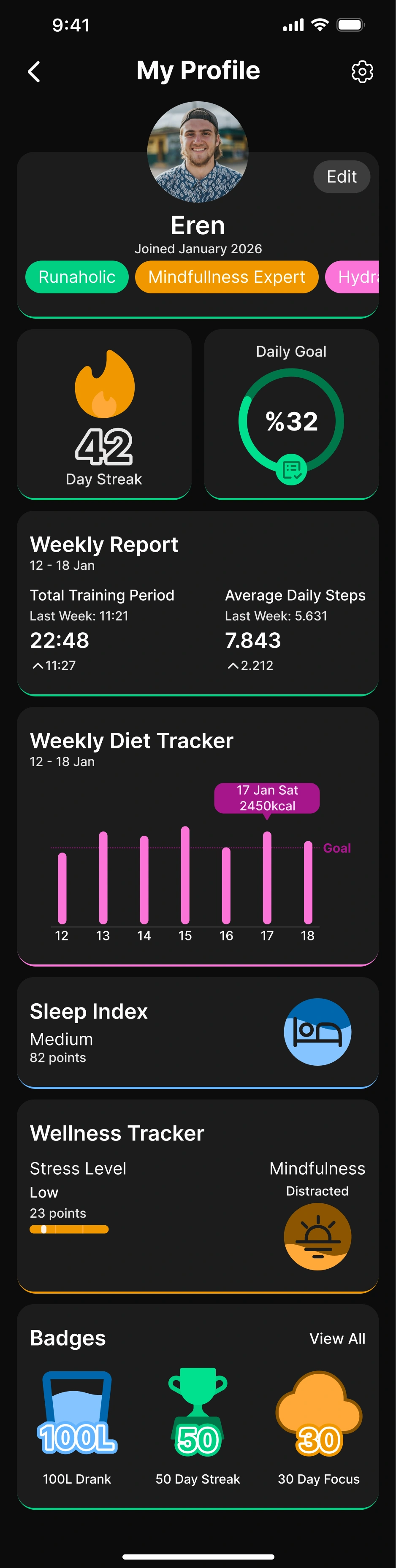
Profile
The profile section includes app settings (notification preferences, account information), personal preferences (daily calorie-step goals, streak requirements), and a badge-based achievement system. Users who reach certain levels have prominent tags displayed on their profiles, increasing social interaction and user engagement.
Staying true to the design concept in the profile as well, I presented summary information in cards and detailed information in bottom drawers that open on tap.
According to analyses by teams at apps like Duolingo and Snapchat, even the simplest "streak" feature has been observed to increase user engagement time. For this reason, I allocated significant space for gamification elements and visual badges in the app.
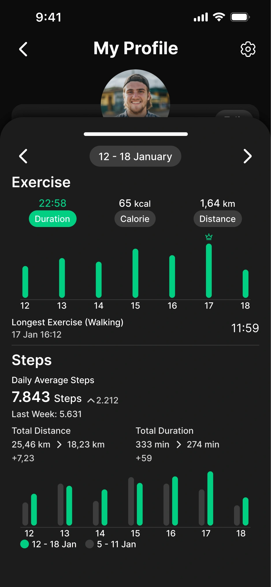
Profile – Bottom Drawer
As on the home screen, I showed detailed information in a bottom drawer that opens on tap in the profile as well. Users can track their weekly goal progress and statistics from here.